Re-Cap:
In the first general lecture of the year we looked at
graphic design and animation history. Within this we were talked through how
there are multiple histories, this is due in part to the expansive variation in
technology across the world and techniques being employed over time. However in
graphic design history books it is typically simplified down and therefore a
lot is missed or looked over. There are
different ways of talking about graphic design and/or animation history depending
on your particular interest and focus.
Our second lecture was based on expanded practises, that
being graphic designers as animators and vice versa. This covered critics’
views as one becoming the other, all dependant on the person whose opinion you
are reading as to which become the hierarchy.
Overview:
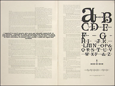 |
| Emigre |
 |
| Octavo |
This lecture was about Émigré and Octavo design magazines,
their differences and how it shapes their positioning in terms of modernism and
post-modernism. I found this lecture quite interesting in the way you can
identify such through their continuing use of typography, layout and style on
top of their own ethos. Émigré also run a type foundry and so many fonts they
produced were used within their own publication, this helped kick-start
popularity for their designs before David Carson’s began to popularise the
style. Although Carson frequently used
their work within his Beach Culture and Raygun magazines, he became against the
idea of Émigré due to their persistence of style. I feel this is due to
post-modernism being about change and a lack of uniformity, whereas due to
their consistent style and layout this would soften the impact that it
produces.
Octavo magazine came about very much with the age of the Mac computer
and has a modernist style. Although these two design magazines both share typography
as a focus they do so in opposite directions. Octavo is very clearly structured
around a gridded system and combines type with image in a concise manner as
oppose to the deconstructive nature of Émigré. The main argument being brought
forward within this lecture is that of subjectivity and identifying a magazine or
designers core incentive so to speak. I.e. when reading an article produced by
say Émigré about a modernist typeface, their review may be biased against due
to the nature of their own magazine and the ethos behind such. Therefore it is
important to think about the writer’s objective and own subjectivity when
judging an article, or perhaps to simply make you question their opinion and
open up to different viewpoints.

No comments:
Post a Comment